Steamship Authority, through Stellar Elements · 2021 to 2023

Booking a ferry got 65% easier.

The Steamship Authority runs the ferries to Martha’s Vineyard and Nantucket, about 3.5 million passengers a year. It had never asked riders what they thought. I ran about 100 interviews in a month, found four kinds of traveler, and led the rebuild of booking around them. In usability testing, the Customer Effort Score improved 65%.

StageWhat happenedStatus
One month
Mapped
Signed off
Tested

What I walked into

In peak season, a confusing booking site doesn’t stay on the screen.

It turns into lines at the terminal and calls the agents have to absorb. Riders had to work out pricing rules and vehicle options they didn’t know, at the moment the stakes felt highest, and the site was weakest on the phones they were traveling with.

The riders weren’t one group. Frequent travelers wanted speed. Occasional travelers needed guidance. Agents and operations staff carried whatever the site got wrong. So the research sorted riders by what they were trying to do, and the redesign answered the moments they kept describing.

“Oftentimes, I’m trying to change a reservation en route… and I’ve got my laptop in the car and I’m trying to open it up and it’s like a mess.”Frequent traveler, research interview
What we designed

Four moments riders described, and the screens we drew for each.

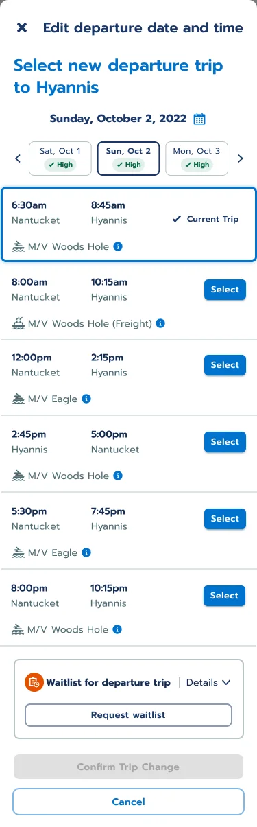
Edit departure: the day’s sailings from Nantucket to Hyannis with the boat for each, the current trip marked, and a waitlist request at the bottom
Edit a trip, on the phone

Changing plans in the car

Change your sailing without the laptop.

The rider in the quote gets the day’s sailings on the phone, with the boat for each one and the current trip marked. A row of dates moves the search a day at a time. If the sailing they want is full, the waitlist is one tap away.

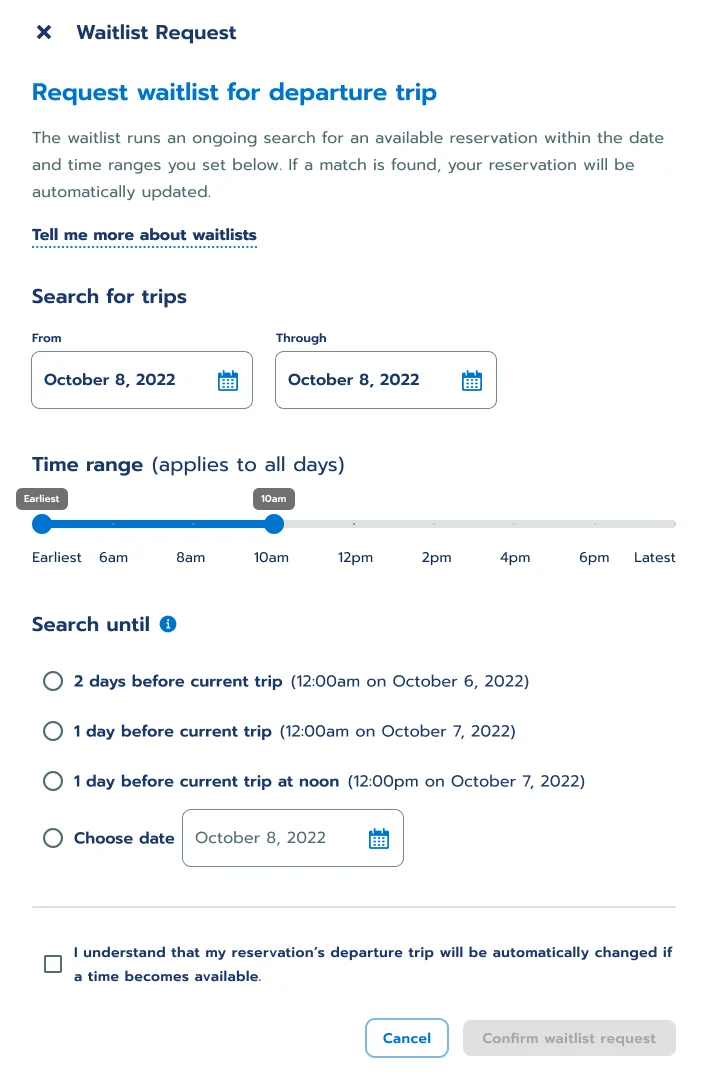
Waitlist request panel: a date range, a time range slider from earliest to 10am, how long to keep searching, and a confirmation checkbox
Waitlist request

A sold-out sailing

Let the waitlist do the refreshing.

Riders set the dates and the window of times they could take, and how long to keep looking. The waitlist keeps searching and moves the reservation on its own when a seat opens. The checkbox says exactly that, so nobody is surprised by a changed trip.

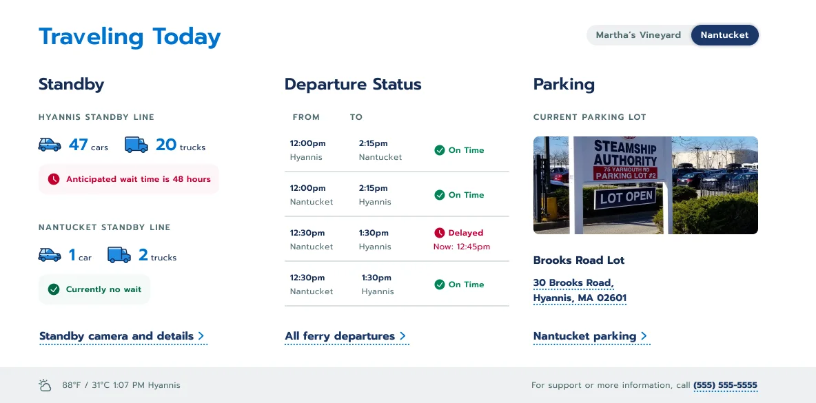
Traveling Today panel on the homepage: cars and trucks in each standby line with the expected wait, departure status with a delay, and the parking lot that is open
Homepage · Traveling Today

The day of travel

Answer the day’s questions before anyone calls.

How long is the standby line, is my boat on time, which lot is open. The homepage answers all three for whichever island you pick, with the delay and the new time spelled out.

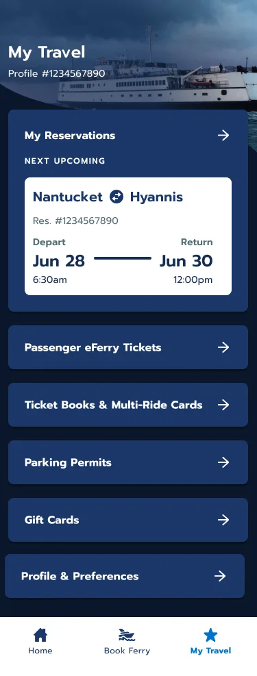
My Travel in the app: the next reservation, Nantucket to Hyannis, June 28 to June 30, then eFerry tickets, ticket books, parking permits and gift cards
App · My Travel

The regular

Frequent riders skip the form.

A saved default trip turns booking the usual route into one choice. In the app, My Travel opens on the next reservation, with tickets, ticket books, parking permits and gift cards a tap below.

What testing said

In testing, the new booking scored 65% better on effort.

+65%Customer Effort Score
Before
After
Customer Effort Score asks how hard a task was. Measured in usability testing of the redesigned flows.

What I learned

What I’d do again, and what I’d do sooner.

Design for the hard moment, not the happy path.

Every screen above answers a moment riders described under pressure, in the car, on a sold-out day or in the standby line. A flow that only works on a calm Tuesday in March fails the people who need it most.

The people who absorb the confusion are users too.

A better site can quietly move work onto agents. I documented how agents and operations staff handle peak season and designed a tooling concept for them alongside the rider flows, so the effort we removed for riders didn’t just land on staff.

Put operations numbers next to the usability numbers, sooner.

Call drivers, abandonment reasons and peak-season handling time would have shown effort moving through the whole system. When teams can see that, debates get shorter.

Designed with the Stellar Elements team. The screens are from the signed-off design files, with sample data.

← Back to client work